The B2B Marketer’s AI Search Action Plan
As the AI search landscape shifts before it settles, we provide four pragmatic steps you can take now to optimise AI search tools for demand capture.
Reading: 0118 322 4395 | Manchester: 0161 706 2414 | Oxford: 01865 479 625 | info@sharpahead.com | Office hours: Monday-Friday 9:00am - 5:30pm
| Office hours: Monday-Friday 8:30am - 5:30pm
| Email | Office hours: Mon-Fri 9:00am - 5:30pm
Why Microsoft Clarity belongs in your B2B digital marketing tech stack
The power of session recording for optimising B2B campaigns
We love Microsoft Clarity. Chances are, it belongs in your B2B digital marketing tech stack. It delivers useful insights that can drive meaningful performance improvements. And it’s free to use, and easy to set up. So it’s a quick win for B2B digital marketing teams.

Not heard of Microsoft Clarity before? It’s a web analytics tool that uses session recording techniques. That is, it records the details of what actually happens within the user’s browser – scrolling, typing, clicks and so on. And then reports those back in aggregate form so that one can understand how a web page is being used by your actual web visitors.
There are many similar tools in the market: Hotjar, Inspectlet and Crazy Egg are some of the better-known ones. Those are all good tools and are worth considering if you have advanced requirements. But Clarity is a great entry-level session recording tool for these reasons:
“Conventional” web analytics tools like Google Analytics can tell you things like the “engagement rate” and “average time on page” for a web page. But those measures don’t really tell you whether the page is doing its job or WHY a badly-performing page might be failing. And they don’t tell you how to improve the page. (I went into some detail about the limitations of Google Analytics for niche B2B campaigns in my recent GA4ward webinar .)
Session recording gives a much more direct, actionable view of page performance and can point you towards specific improvements.
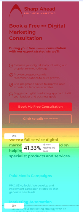
Here’s an example of a Clarity report for the mobile version of one of our own landing pages:

The colours and numbers on this “scroll heat map” show the percentage of visitors reaching each vertical position on the page. So for example only 25% of our visitors scrolled down far enough to see the “Marketing Automation” heading.
Take a moment to look at the image. Can you see any issues?
For me, this Clarity report has highlighted a design problem with this page. Only 41% of mobile visitors are seeing the text (in the yellow/green area of the colour coding) which says “We’re a full service digital marketing agency…”. That’s important text! Without it, the offer of a free B2B digital marketing consultation makes a lot less sense. A person might view the page without scrolling and decide not to bother taking any action, whereas if they’d seen that extra copy, they might have been persuaded to go ahead and book a consultation.
Frustratingly this important text is only JUST below the fold. You can see from the heatmap that if it were only a line or two higher up, 75% of visitors would see it – almost twice as many!
This Clarity report not only diagnoses the problem, but it allows us to come up with some potential solutions. In this case, we’re going to trim down the opening section so that it uses a bit less vertical space, allowing the “We’re a full service…” text to show above the fold for all users. That’s an easy change that will only take us a few minutes to implement. We’ll test that change and expect to see an improvement in conversion rates as a result.
Imagine instead all I’d told you was that this page had a high bounce rate or a low engagement rate. You would know there was an issue, but you’d have no idea what aspect of the page’s design was to blame, and so nowhere to start for choosing potential solutions. Most likely, the page would have stayed unchanged.
We find these scroll heat maps incredibly useful for B2B landing pages, where the user journey is often just a single page and where we have difficult tradeoffs to consider in information architecture – which content to prioritize above the fold, in particular.
There are many other useful features in Clarity, including:
These features are all enabled as standard, so you access to them all as soon as you have put the basic Clarity setup in place – there are no complicated setup decisions to make.
If I’ve convinced you that Clarity has a place in your tech stack, please give it a go! The setup could hardly be easier:
Microsoft have given careful thought to the GDPR / privacy / compliance aspects of the system, so while you shouldn’t take these for granted, the use of Clarity shouldn’t cause too many concerns for your company lawyers. And the technology has negligible impact on page speed for the end user. So it’s hard to think of any material downside to the use of Clarity. And the upsides can be huge – if you discover and fix a page design issue that improves conversion rates by even a few percent, that’s extra ROI on every digital campaign.
We’ll return to some other ways to use Clarity for B2B campaign optimisation in the future. For now, if you’d like any help with Clarity or any other aspect of B2B marketing, we’d love to hear from you!
Receive our biweekly newsletter and stay up to date with the latest B2B digital marketing news and insights.
As the AI search landscape shifts before it settles, we provide four pragmatic steps you can take now to optimise AI search tools for demand capture.
This blog is for every marketing team currently organised, incentivised, and optimised around lead generation: your current strategy could kill your brand in the age of AI.
Although AI has changed how content is created, it has not changed why most content underperforms. Find out how AI content engines can change that.