The B2B Marketer’s AI Search Action Plan
As the AI search landscape shifts before it settles, we provide four pragmatic steps you can take now to optimise AI search tools for demand capture.
Reading: 0118 322 4395 | Manchester: 0161 706 2414 | Oxford: 01865 479 625 | info@sharpahead.com | Office hours: Monday-Friday 9:00am - 5:30pm
| Office hours: Monday-Friday 8:30am - 5:30pm
| Email | Office hours: Mon-Fri 9:00am - 5:30pm
The Power of 5 Second User Testing and How To Used It To De-Risk a Brand Refresh
Subheading
Breakout sentence goes here

It can be used to add value and reduce risk in a whole range of marketing projects by providing insight into the effectiveness of the visual design, headline copy and information architecture of a piece of content.
These are the key advantages of 5 second user testing:
It’s plenty of time! We’re looking to test the immediate visual impact of the content. We are looking to find out whether it gives a strong and effective first impression, and to find out if there are any sources of confusion that need to be eliminated from the design.
The first impression isn’t the whole story about marketing effectiveness but it’s a crucial component. For example in search marketing, if your landing page doesn’t immediately create a positive impression for the visitor, they won’t hang around to read the detail – they’ll hit the back button and move on to a competitor’s listing.
Yes! Perhaps surprisingly well. We’ve used 5 second user testing with great success across a diverse range of B2B marketing projects. We’ve a detailed B2B case study example below.
Many forms of market research are difficult for B2B because of the need to work with specialist research participants – people who are expert in the subject matter under test. But for 5 second user testing the panel members don’t need to be experts in the subject matter.
We’re not concerned about how a person responds to the complex details of the content under test, just their first impressions – and these are usually much the same whether they have subject matter expertise or not.
There are often cultural elements to how people process visuals, so ideally we use a test panel that is broadly representative of the target audience in terms of geographic location, age and education level. But we don’t need to be more specific than that for most tests – which makes test setup and execution much faster and easier.
Here goes!
We’re in the process of refreshing our branding at Sharp Ahead. We like our current branding but we don’t feel it quite represents the agency we are today, especially with our last couple of years of growth. So we’ve developed a refreshed brand concept which we all absolutely love, and we’re keen to roll it out.
But with any project like this it is easy to get too close to the work and too attached to a creative concept. We are not our own target audience! So we wanted to reduce the risk of our rebrand by testing the new branding against the old.
We chose to test one of our most important PPC landing pages – a page that allows a prospective new client to sign up for a free initial consultation with one of our directors.
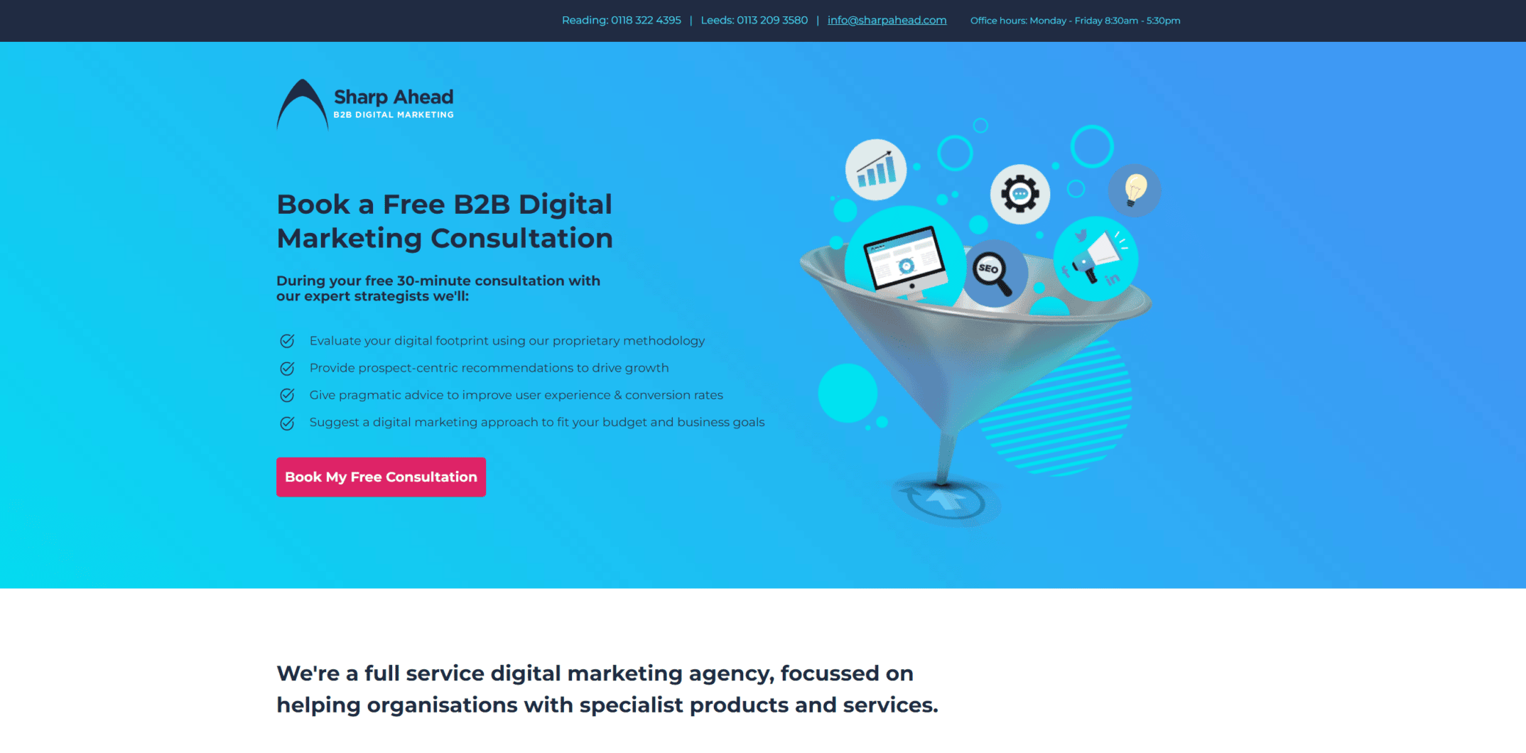
Here’s the current version of the page with the original branding:

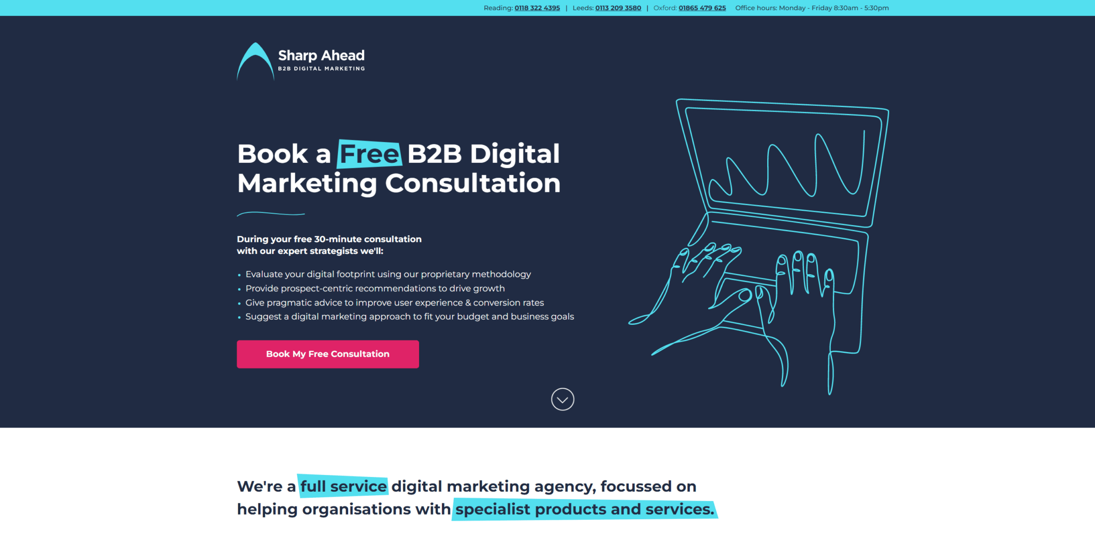
And here’s the new design – note that this is currently just a flat design, not a live web page. (One of the advantages of this test method is that we can test an early design like this.)

We tested the two versions with separate panels – this is important, we don’t want to “educate” a participant about the first version of a design and then have the same participant give a distorted impression of the second version.
The results gave us a lot of confidence in the new branding. For example the new branding scores 23% better on an index of “professionalism” – a big improvement that aligns with where we are looking to take the brand.
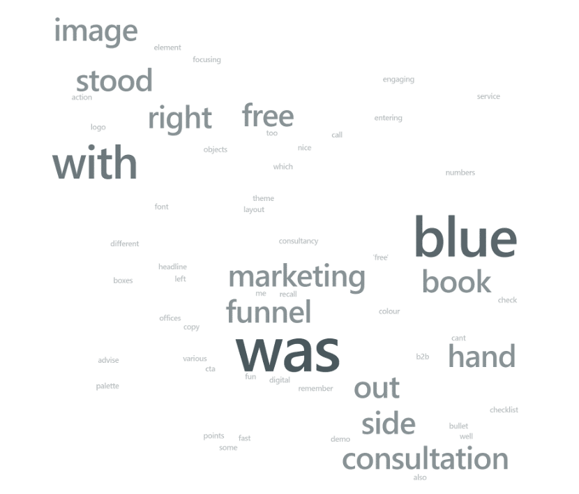
The change in the page design was also intended to simplify the visuals so that they were less distracting – allowing the reader to focus on the CTA and other key elements of the page. Our test gave us some confidence that we’ve achieved that. Here’s the word cloud showing what people recalled the most strongly about the original page:

Note how “funnel” and “book” and “image” stand out there, at the expense of “consultation”. This word cloud suggests that the visuals are distracting from the primary CTA, not enhancing it.
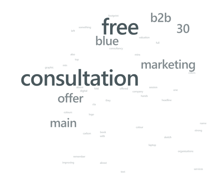
Here’s the corresponding word cloud for the new design:

This is a much better result! The panelists have seen and recalled the offer of a free consultation, and the fact that we’re a b2b marketing specialist. So we can have a lot of confidence that the new design has achieved its objectives.
So, there we have it, a perfect example to illustrate the benefits of running 5 second user testing to provide insight that can help your brand evolve positively.
Receive our biweekly newsletter and stay up to date with the latest B2B digital marketing news and insights.
As the AI search landscape shifts before it settles, we provide four pragmatic steps you can take now to optimise AI search tools for demand capture.
This blog is for every marketing team currently organised, incentivised, and optimised around lead generation: your current strategy could kill your brand in the age of AI.
Although AI has changed how content is created, it has not changed why most content underperforms. Find out how AI content engines can change that.